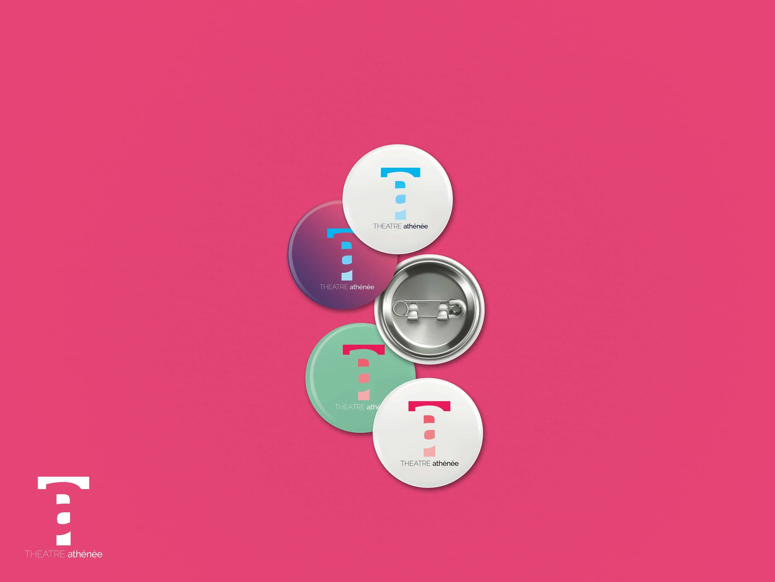
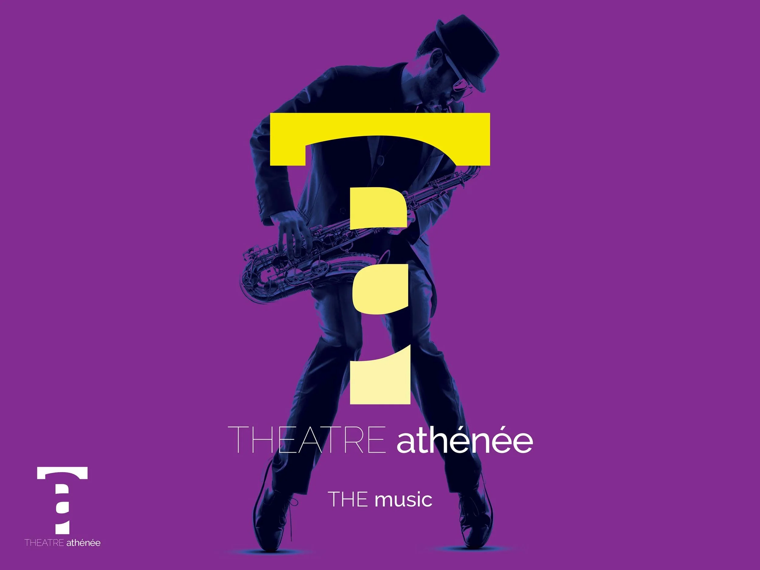
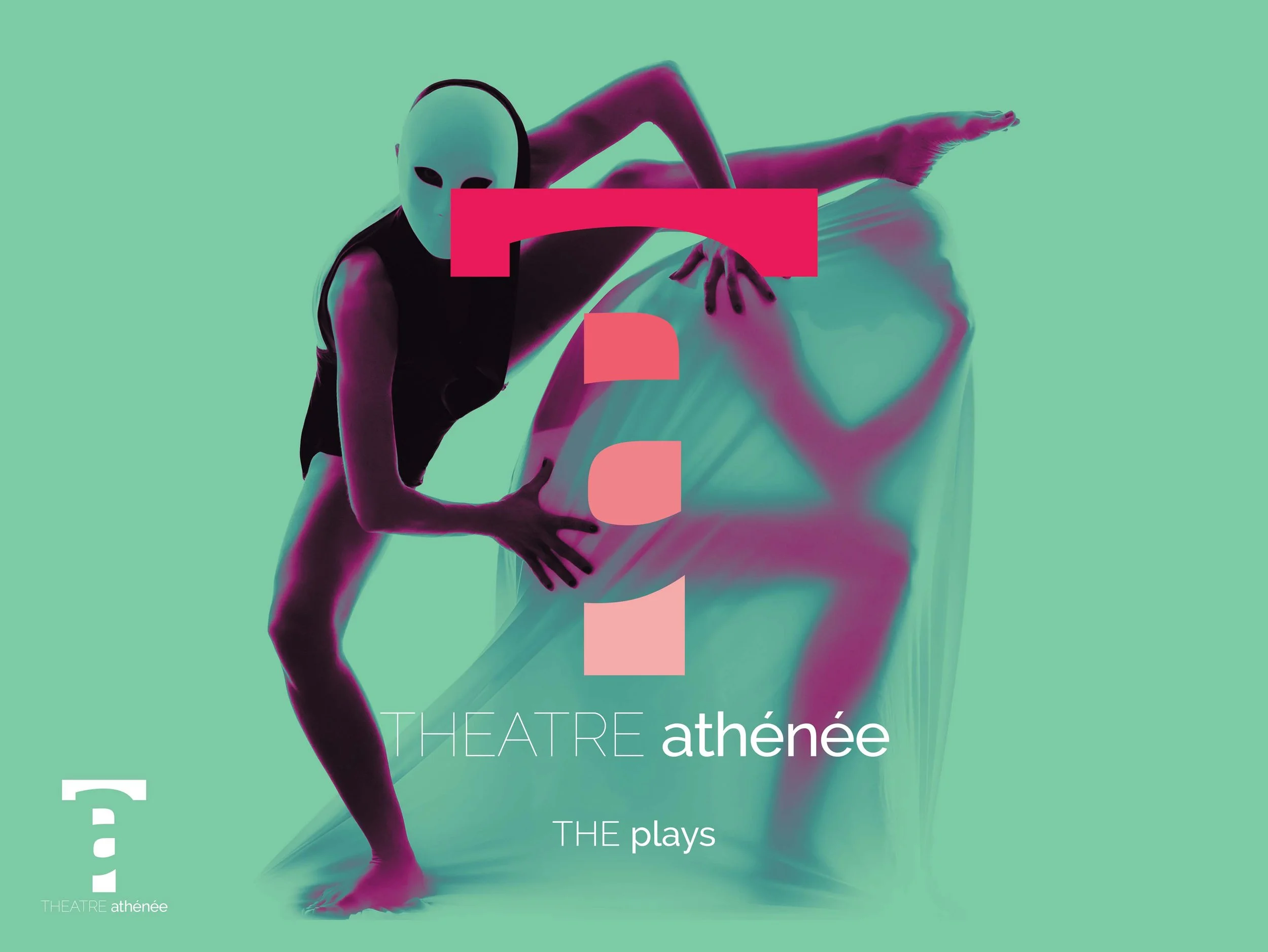
TAJ
Re-Branding, Visuals
2017 | Lebanon
A cultural hub that marked the childhood of tons of kids for generations called for a drastic face lift to encompass its fresh and new line of activities. The fruit was a smartly executed logo (negative space), French-inspired and supported by showstopping visuals.